Aug 19th, 2013 — Earth Science • Environmental Science
Visualize GPS Data with ArcGIS Online
Whether you’re collecting water quality, weather, or species distribution data, there are often patterns that are only visible in a geographic context. Geographic Information System (GIS) software can help students visual data spatially but is often expensive and complex. With ESRI’s ArcGIS online you can visualize data in seconds with a FREE account! Here’s how to get started visualizing your geographic data!
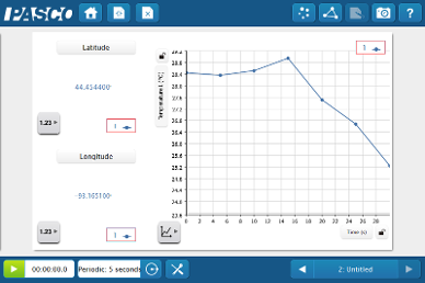
Collect your data using GPS sensor.
Export the data to a text file.
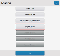
Open the share menu
Select export data from the available options (connect a flash drive to export from the SPARK science learning system)
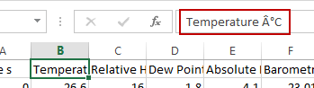
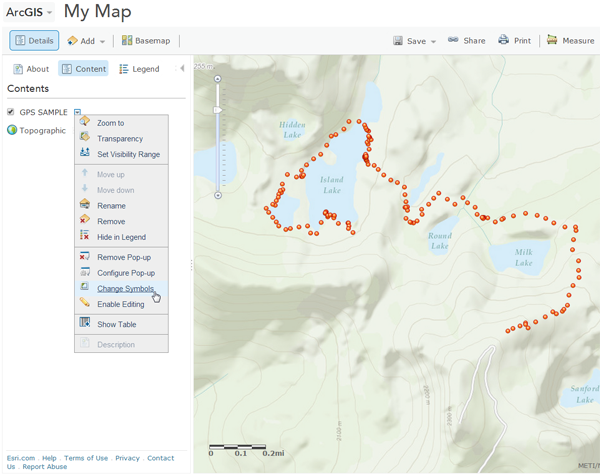
Edit your data
Open the tab separated text file in a spreadsheet editor to manipulate heading names. It’s important to remove any special characters like degree symbols from the headings.
Login to ArcGIS Online
Sign up for a free public account or login to an existing account and go to the MAP tab.
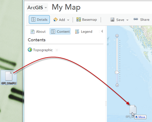
Drag the exported data onto the map.
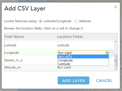
Map the data fields for latitude and longitude
That’s it!
Now you can edit the layer to visualize the data for different sensors.
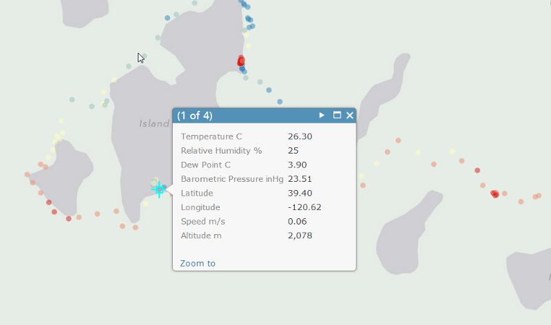
This is an example of a hike in the Sierras with GPS and weather sensor. The data shown is the temperature along the trail.